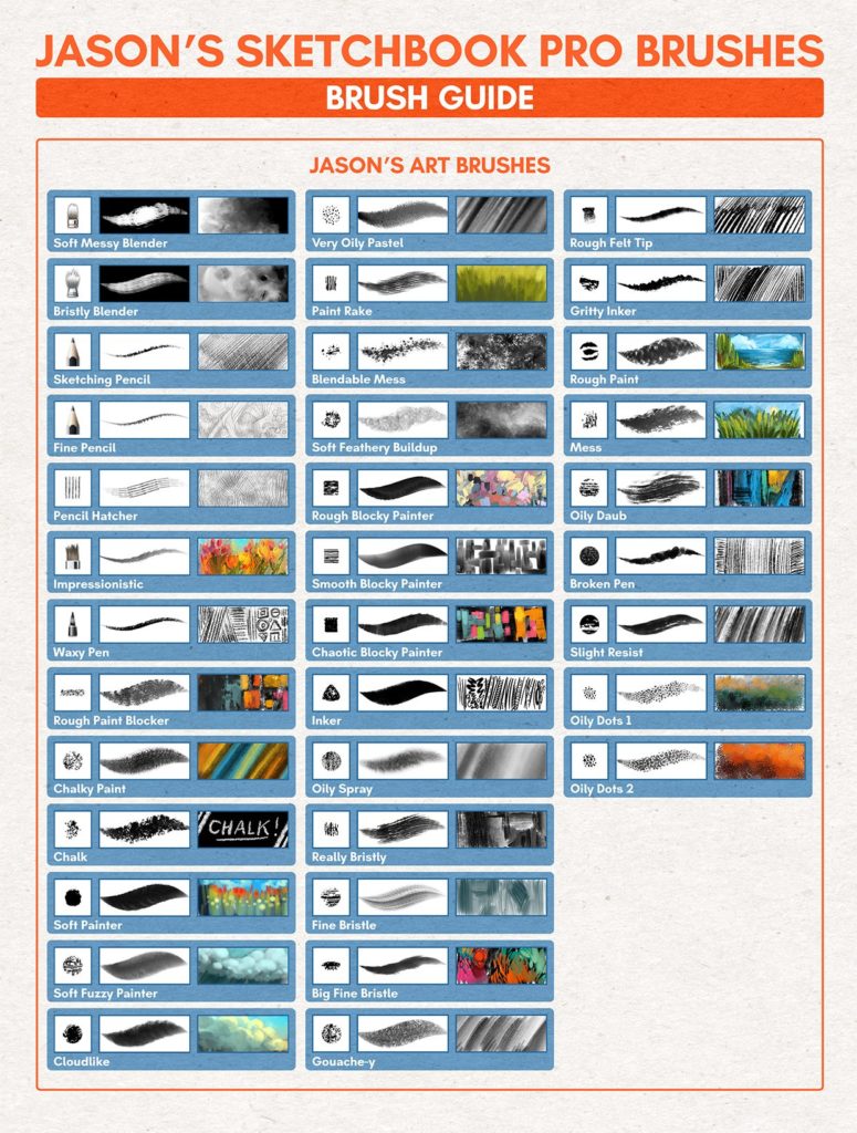

It depends on how you use it though, you have to know how to work your way through the size and opacity. I have used a variety of textures overtime but what I've noticed is that I - eventually - come back to using HR, frequently. Making a hair can be quite tricky as most times one may get confused to which to use. And pressure sensitivity is really the peak of any image outline. Some may even prefer the paint tapered over the Medium Tip Marker given that it simulates pressure sensitivity - not literally. All of these can be used in place of Medium Tip Marker. Paint Tapered, Fineline Pen, Digital Brush. In place of opacity, it has a malleable flow and wetness. The only con about it is that the opacity can't be adjusted but really, it's an outline, you don't need reduced transparency. Now, there are a couple of brushes that outline greatly but I just find myself comfortable with this brush, sitting in the designer section.


To make a neat outline - neglecting factors such as resolution or the instability of the hand - we will need a good brush. An outline is needed for the basic colour filling at least. When we start an artwork, what do we first do? Well, we outline. This episode will only be about brushes but it promises to be insightful. You have to know how each brush functions so as to make a perfect combination. After you've gotten your pictur quality right, your work will essentially be a combination of different types of brushes which you can't afford to get wrong. Next to picture quality in the table of relevance sits texture.


 0 kommentar(er)
